Fonts, no gradients, green — make it not look vibe-coded
5:21The anti-vibe-code design pass: Outfit font, no gradients, no orange — a shade of green for a food brand. Watch the same page go from AI-made to real.
Transcript preview
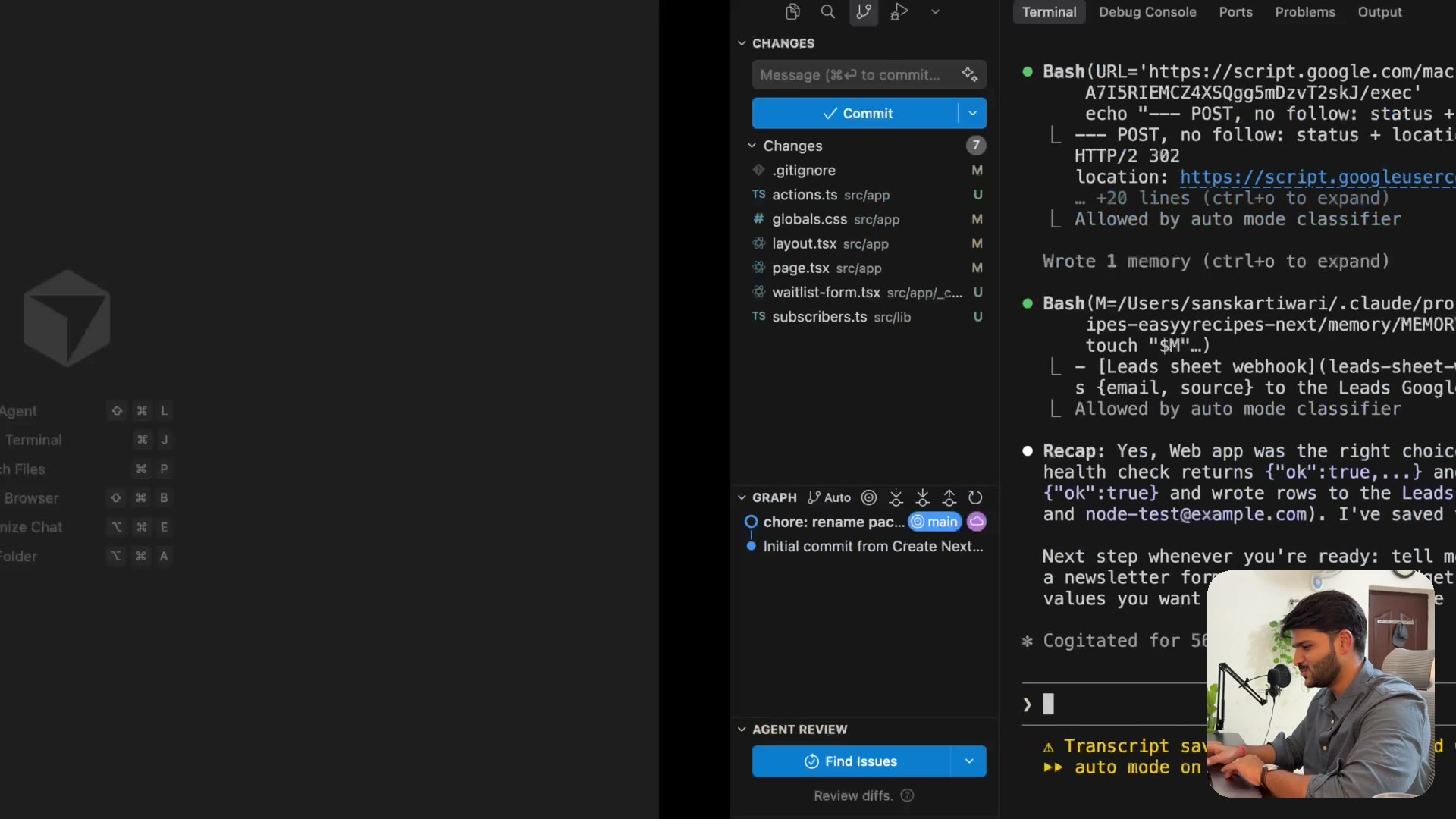
that it says over here, that it tried to save something. Let me check if my sheet got updated. Add one lead to it. Name it Sanskar. Hey @sanskardevari.io, time off right now. Let's give it a second. Okay, this is what happened guys. So the name of the sheet was leads, right? Not the sheet one. So we can delete this. And this will be our sheet where we'll have all our data. You can kind of structure it. I like Google font and then, I don't know man, maybe you structure it center for better clarity. I will give email more space, date a little less. They have a timestamp thing, which again, you might not like to read, but just keep it there. So yeah, you see, there's a source as well for that. Perfect. I think we are ready to accept leads from our website. So I'll go back over here. Now we are designing the landing page, right? This is our landing page, looks like shit. Landing page is life. So I have a preference for a font called outfit. I hate animation. I don't want any gradient. I want to use outfit font. I hate animation. I don't like gradient. I want to use outfit font. I need a proper header. This looks like shit. I just made an icon. So then I'll give it to the icon, which is this one. Put it on top right hand corner,…
The full lesson — video and transcript — is part of Vibe Coding.
Get Vibe Coding →